Last year we finally built a house of our very own. I cannot tell you how exciting it was to be able do exactly what we wanted for a project. Exciting…and a little paralyzing. I work with clients on occasion, but at this point CBC has enough projects to keep this part-time designer SUPER busy. So TYPICALLY I am thinking about a very universal customer. I try to design each house as a unique entity, with a style and flair all its own. We don’t do cookie cutter “spec” houses, which is awesome, and creatively fulfilling, but it is sometimes crippling to try and reinvent the wheel every time we build a house. So imagine my surprise when it was HARDER to determine what WE wanted for ourselves! Since this was ground up construction, we truly had a blank slate. Ultimately, I ended up marrying a variety of options that spoke to me both visually, and that I could AFFORD. Of COURSE I wanted:
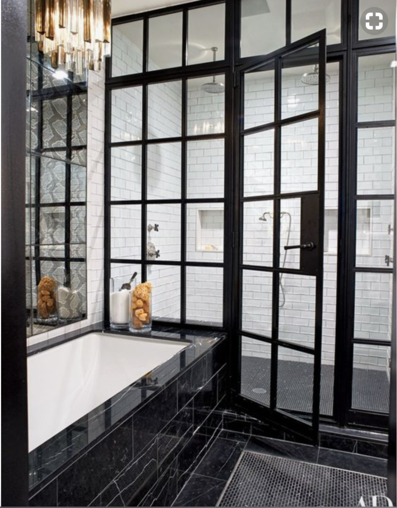
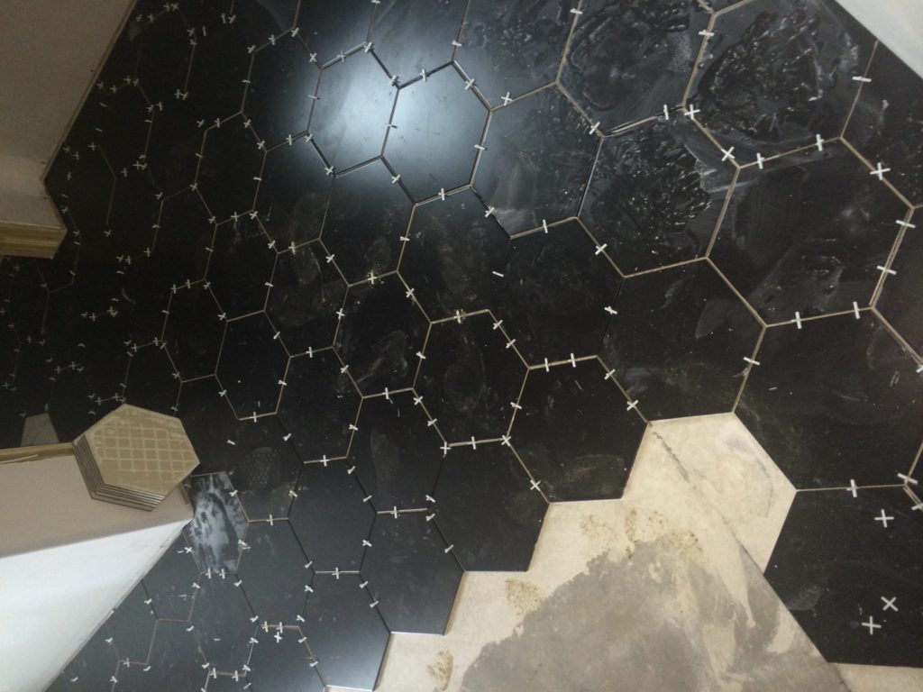
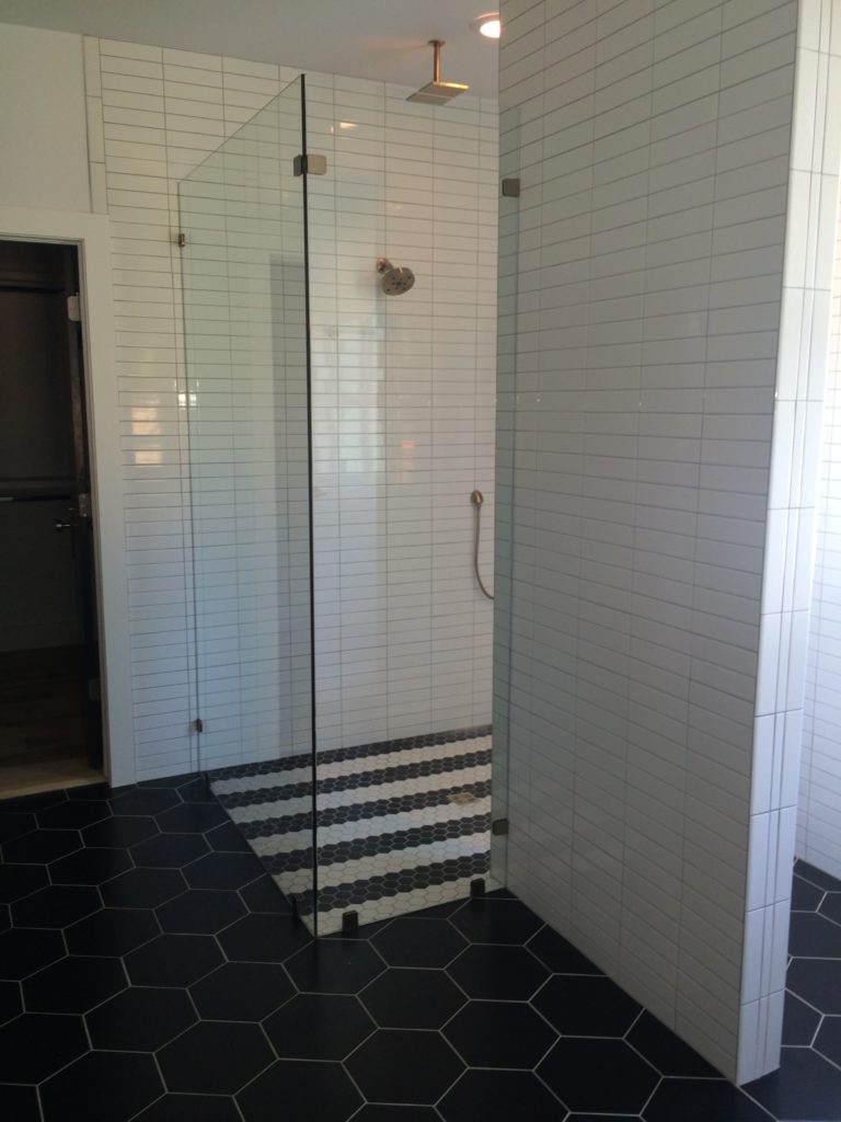
But there were other things I wanted more than a $14,000 steel grid for my shower…hard to believe, I know:) I decided I wanted the graphic element to come in with the contrast between the white and black hexagonal tile. I decide to stripe the shower floor, but leave the remaining bathroom floor the large format tile—seemed easier for clean up. But I am getting ahead of myself. Let’s start with the bones of the whole project…
I actually did a pretty detailed mood board, mostly because I was going through a bout of insomnia…plus, we had been talking about doing a house for us for quite a while!!
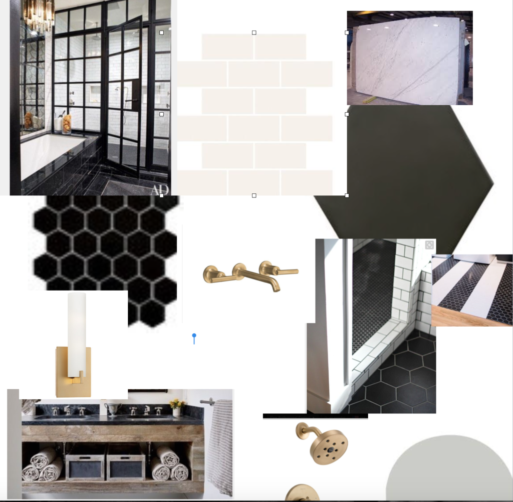
Sorry, the file was too large…or something! Sorry, blog growing pains!
Anyway, you can see here that I wanted black and white, large scale hex, natural wood cabinets, marble, and brass.
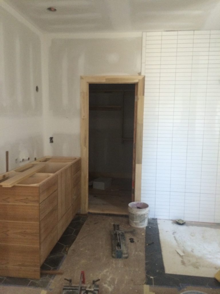
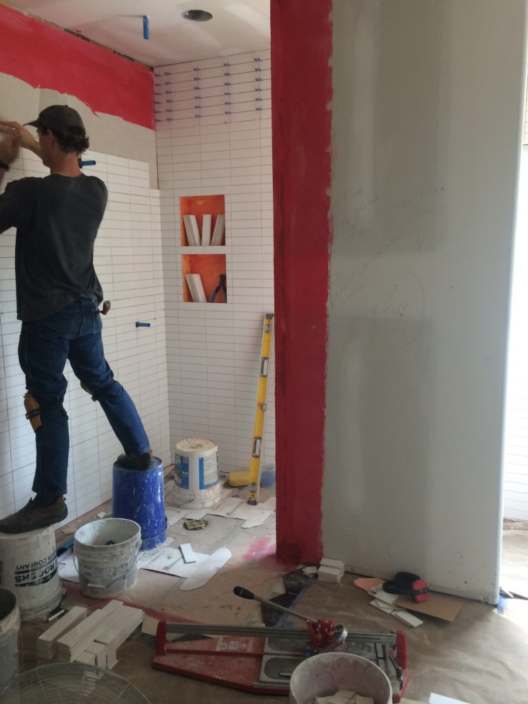
Sticks and sheetrock are no fun to look at, but here is where the fun stuff started to come in:
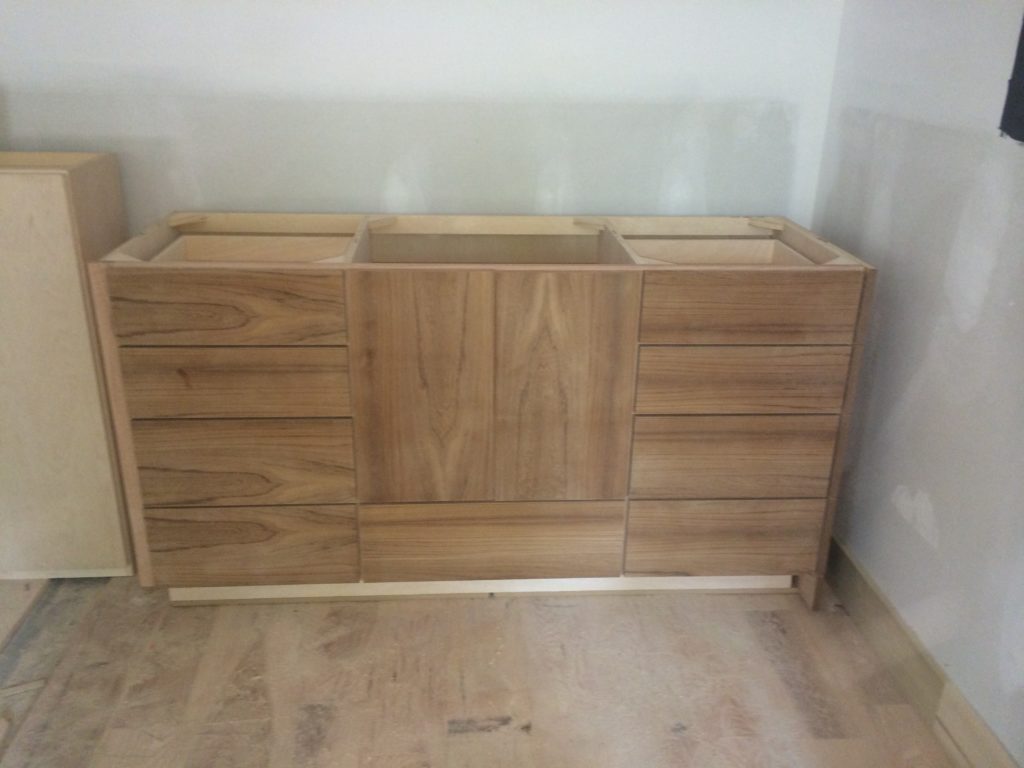
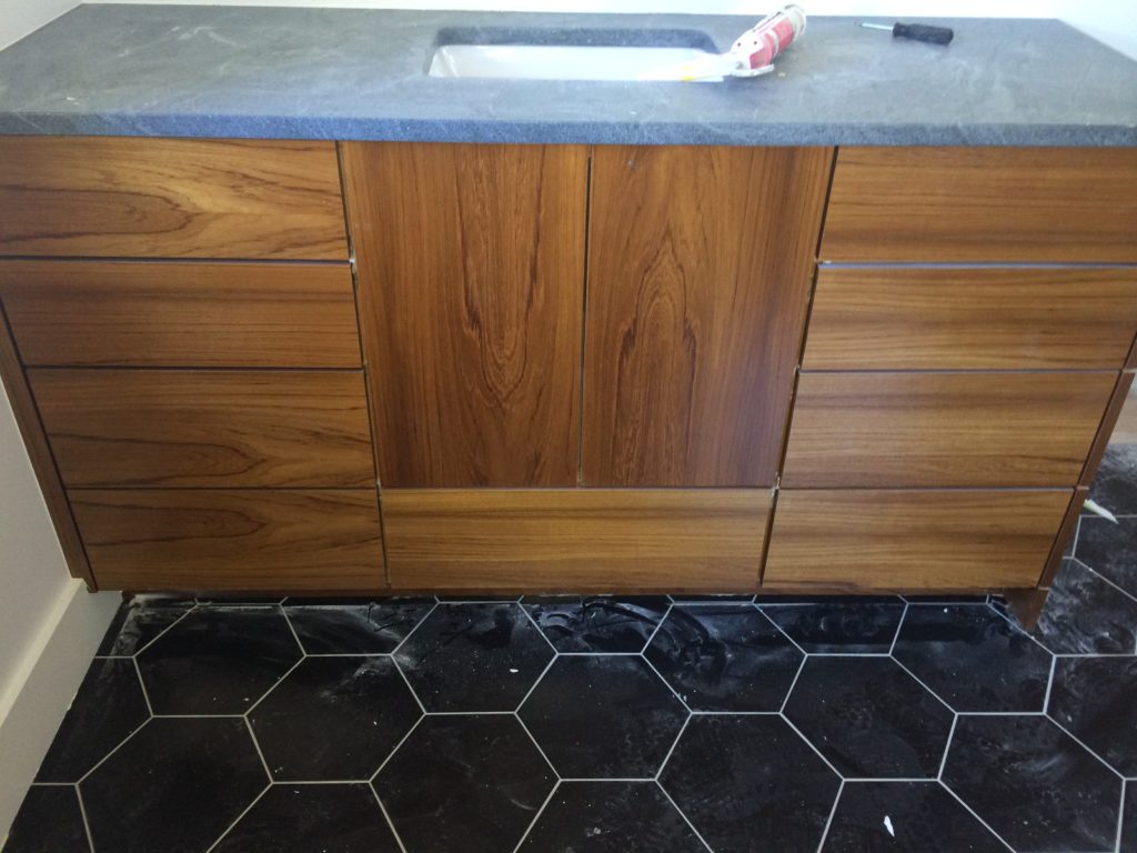
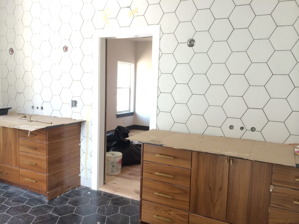
We also had access to some CRAZY vintage teak through our awesome cabinet company, Woodstock. Clark Cottongim’s dad, Scott, started the company 50 years ago, and has a tendency to hold on to certain materials, “just in case”. Clark C. was getting sick of looking at this teak taking up a corner of his shop, so he offered to make us something cool—and he definitely succeed. Look at this bad boy—and there is a matching one. The natural wood in here was essential to warming up this very graphic white and black bathroom. While we wanted it to feel modern, we wanted it to be very inviting and kid-friendly!
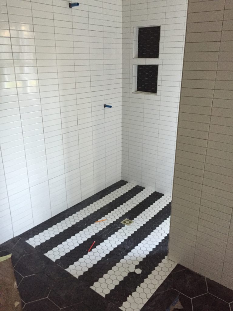
The walk-in shower without a tub was a slightly controversial decision…for everyone but us. I think it is SUPER important for every house to have at least one tub for kiddo bath time, but Clark and I aren’t necessarily bath people. We were happy to give up the tub for the opportunity to have more space in our closet, which ultimately afforded us the ability to have a powder bath (here). The zero entry shower, which is handicap friendly, is AWESOME, and this is the shower the family used the most. We just lined the kids up in there like a car wash!
We went with soapstone in here to break up the black and white even more–again, I originally planned on white marble, but the texture and color of this soapstone just spoke to me. It softens everything up.
Next up, the wall tile!! We decided to mirror the hex on the floor with the hex on the wall in opposite colors–we love a good, graphic statement.
When we are closing in on the VERY END, we get glass. Cant have that on an active job site for very long…
Hope you are ready for the reveal!!!
