If you have been reading, you know that it is just me on the design end of things here at CBC. I often bounce ideas off of Clark, and he will tell me what he thinks, but most of the time it is me, trying to figure out what to do with each and every project. So this kitchen at the Evanston Project was a refreshing change of pace–Clark chimed in at the very beginning with a major focal point that he was dying to use in the kitchen…a bright, colorful stove. I IMMEDIATELY loved the idea. I have always been one to go bold, even though we mostly do spec projects. But the question was: what color?? Here in Oklahoma, a few colors are fairly polarizing. A bright, crimson red that pops against your cabinets?? Well, you gotta be an OU fan! A lovely burnt orange that adds depth and warmth to your kitchen?? OBVIOUSLY you are a Cowboy! We had to think long and hard (or for AT LEAST ten minutes;)) about what color we were going to select. We knew we wanted to go with a 36 in Bertazzoni range, so we consulted their selection and that electric yellow was calling our name. Decision made.
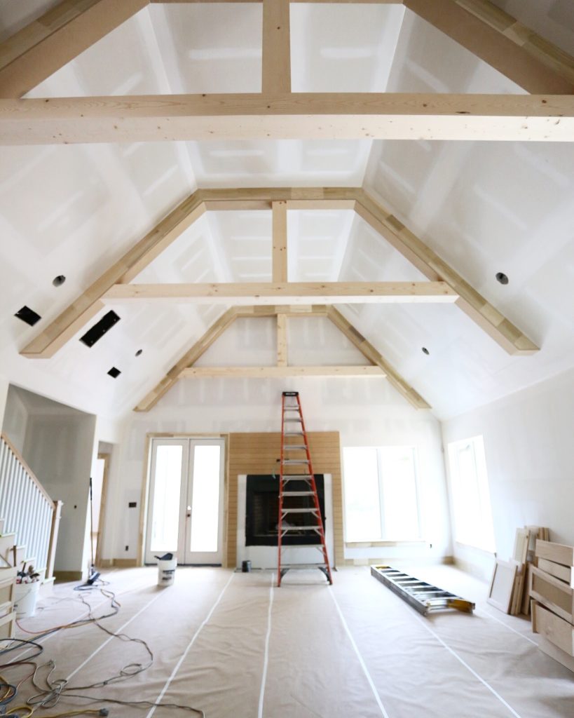
You can see that cabinets were starting to come in here, but this is the view of the living room from the kitchen.
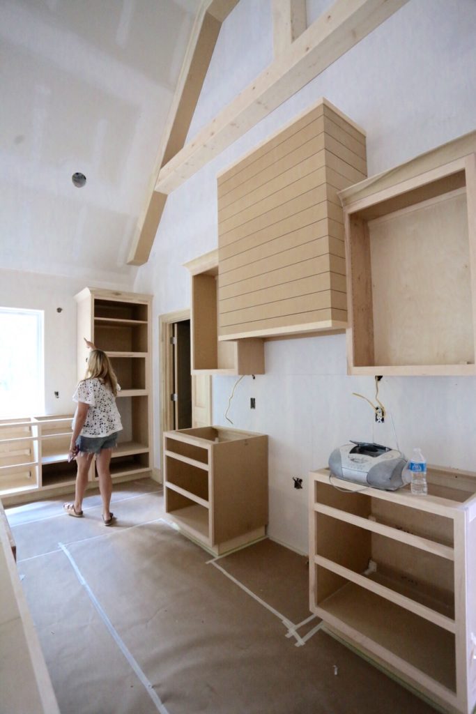
I am sure whatever I am indicating here is RIVETING. Actually I think I was saying we were going to need schluter (metal finishing piece for tile) around that window for the backsplash, but whatevs. See our unfinished, gorgeous Woodstock cabinets here.
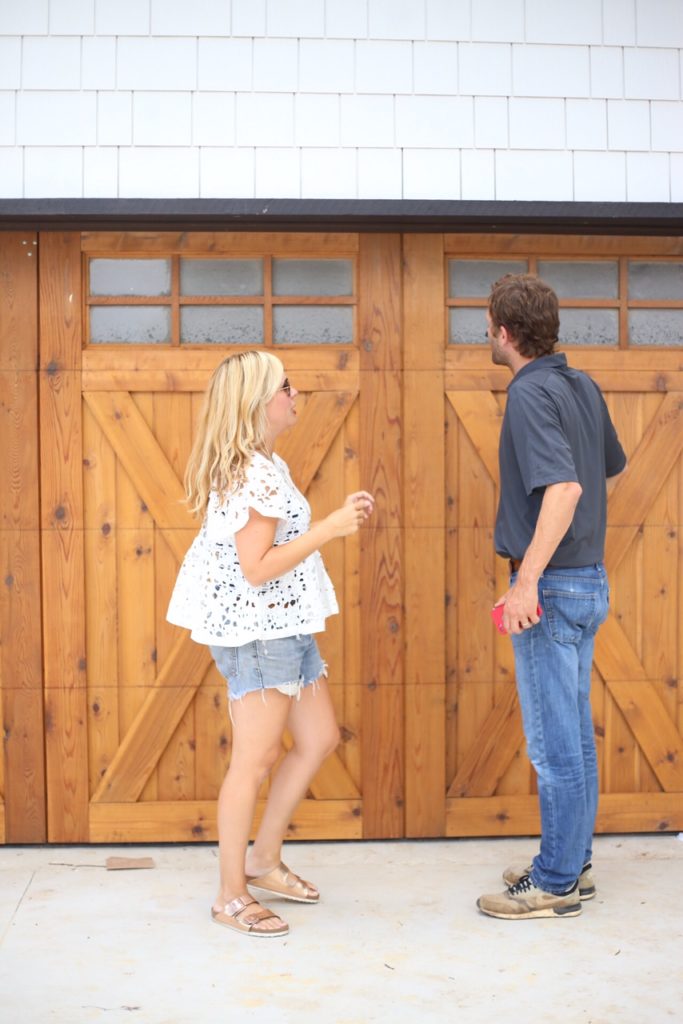
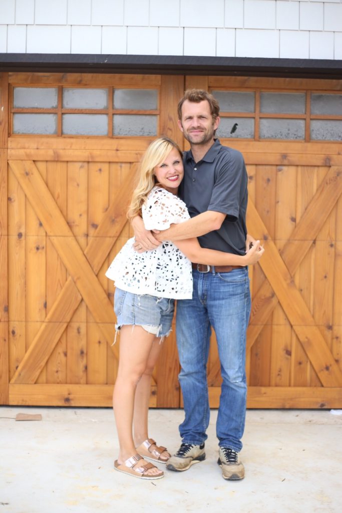
Chatting it up about construction dust. Our lives are super interesting;)
In light of our BYS (that’s Big Yellow Stove) decision, I was going to keep the rest of the house a pretty simple palette of black and white, with a bit of gray thrown in for good measure. Add a little natural wood and I was SERIOUSLY excited for this house. Not only did the BYS inform my paint decisions, it informed my tile and light fixture decisions in a big way.
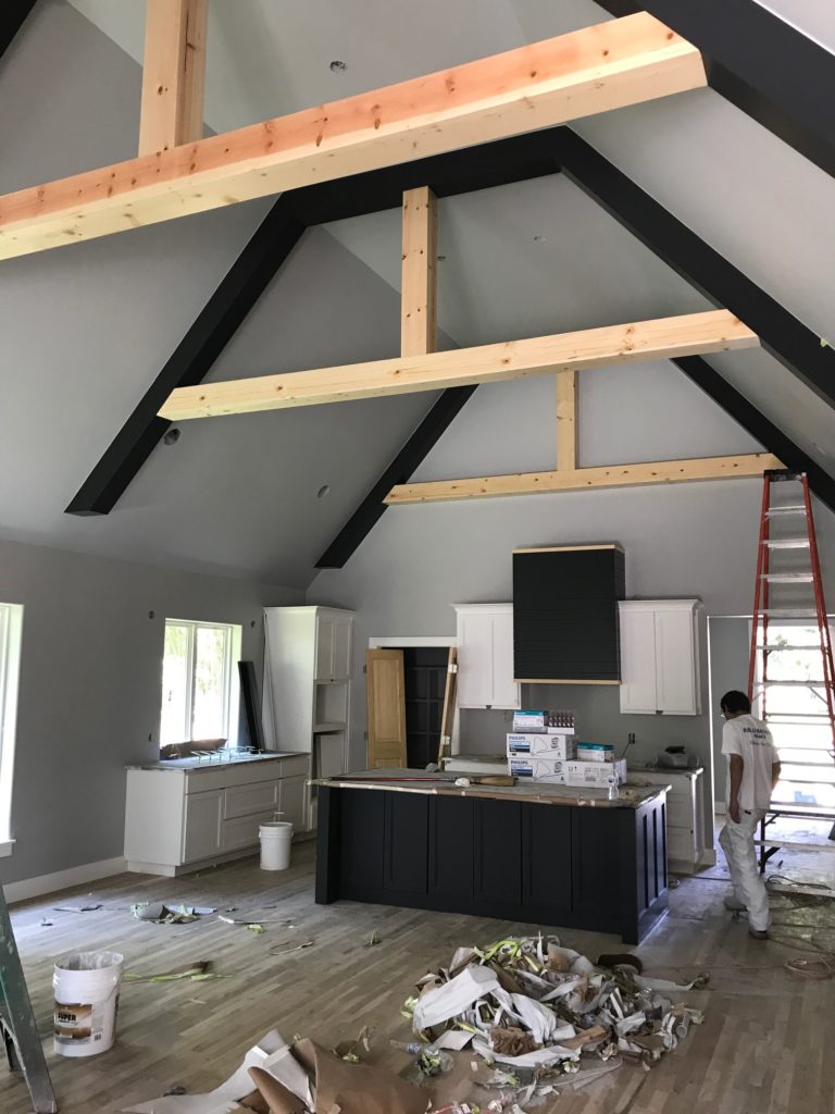
UNVEILING!! A huge mess, but man, I love it!
Those beams are white pine with a clear coat and they are stunning.
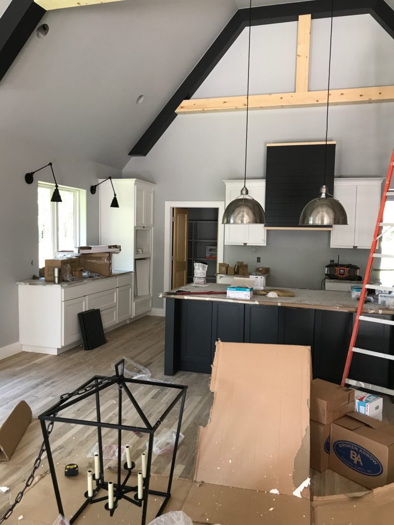
Then our SWEET lights came in–I will link up all sources in the reveal post!
I wanted the lights to be beautiful, modern, with a traditional edge. Varying your metals provides your space with a very collected look, and is a great way to provide depth and warmth. I went with matte black for both the window swing arm sconces and the large dining fixture, but wanted the antique nickel for the island pendants. That silver will eventually be echoed in the stainless steel appliances (outside of the BYS, obvi), and our polished nickel sink fixture. 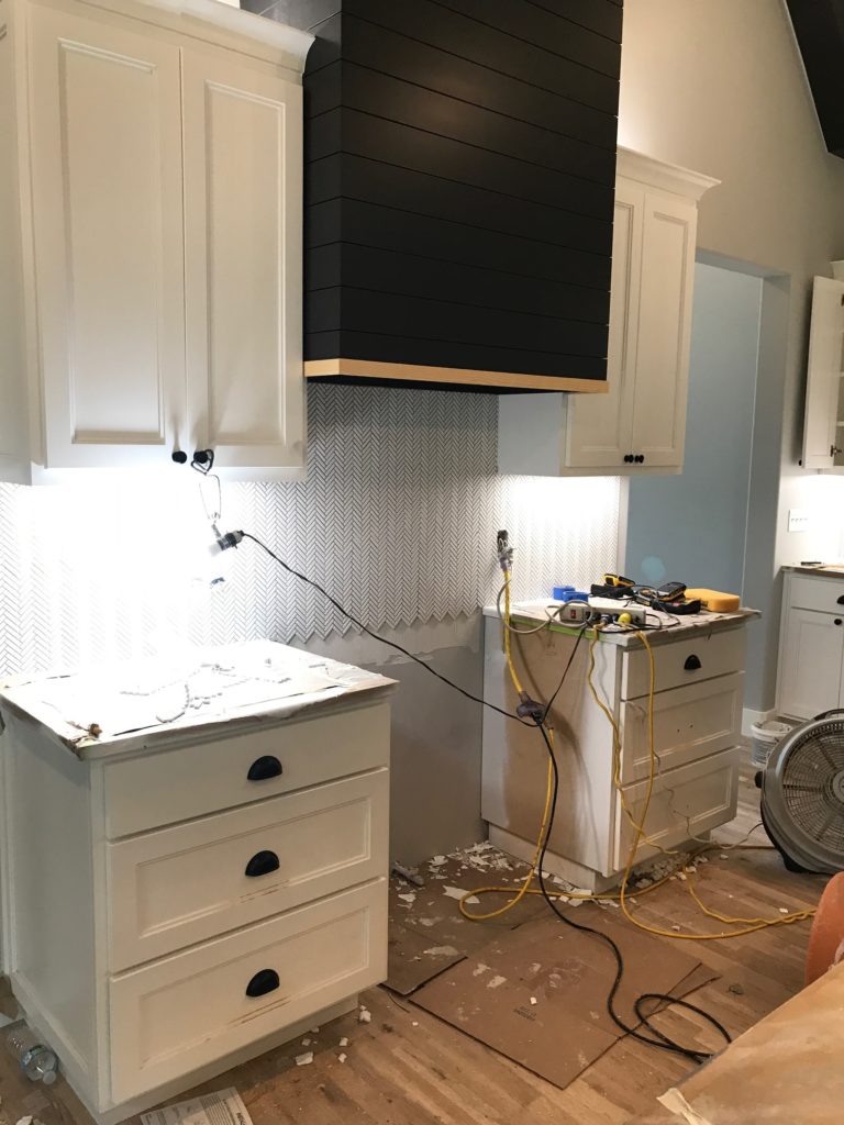
Backsplash day is such a great day. Since I had a lot of significant moments in this kitchen (BYS! Black Island! Matte black hardware! Stunning light fixtures!), I wanted the backsplash to be more about texture than color or pattern. I searched long and hard for this GORGEOUS white herringbone. It brings in just the right pattern and texture, without being all “look at me! look at me!”.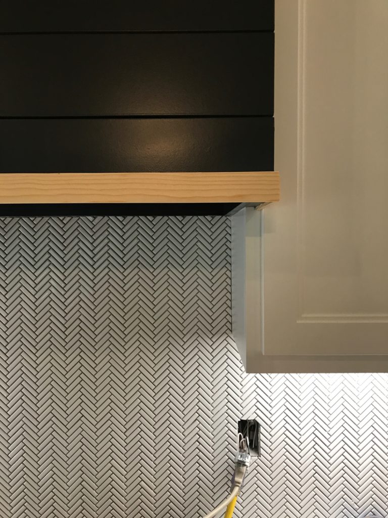
Yowza, she purrrty. Don’t worry–I will link her up in the reveal too.
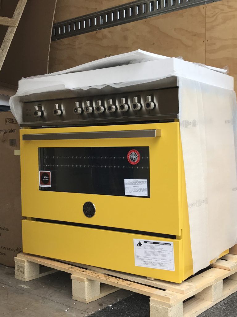
And here she is, folks–the piece de resistance!
Want to see this incredible range in all her glory?? Check back for the reveal post!
